The one thing that is essential for marketing and journalism is accurate data. The right data allows one to make the right decisions and host successful marketing campaigns. Data visualization allows marketers to do so.In this blog, we will be discussing what is data visualisation and how to turn your transcripts into data visualisation.
What is Data Visualization
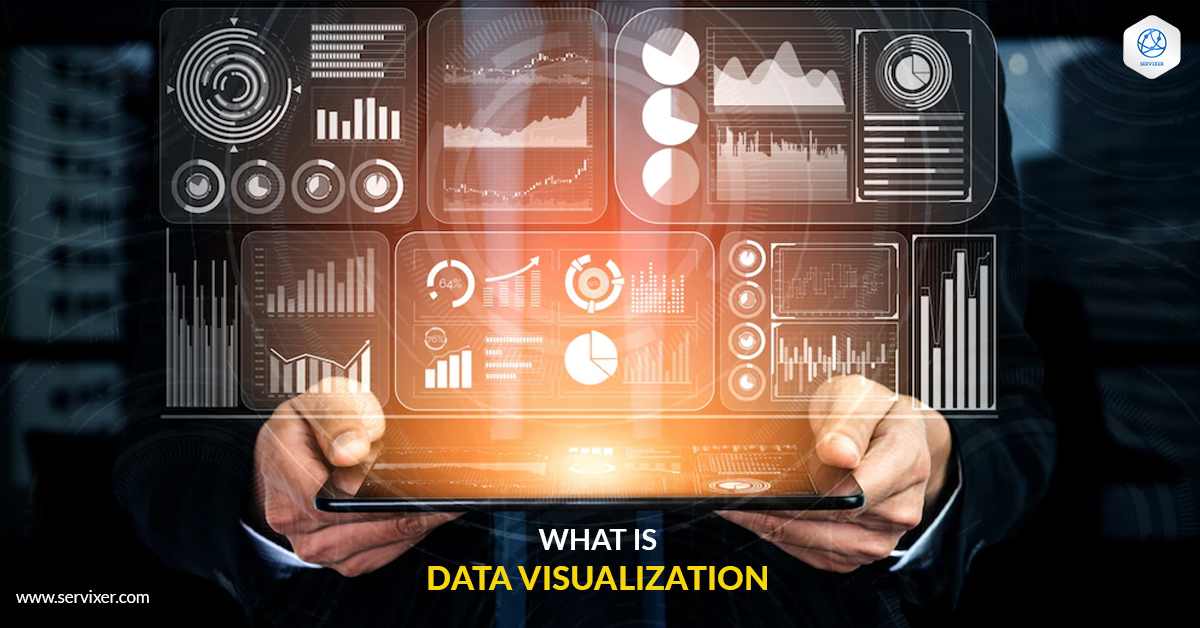
There are many tools that can be used for marketing, and one of them happens to be a data visualization. This tool allows us to take any kind of file, for example, transcripts, and make marketing tools out of them. It is done by the use of charts, maps, infographics, and various others visuals and graphics.
Data visualization allows your users to analyze the trends and patterns in your data without having to waste too much time. It allows your audience to foster a deeper understanding and allows them to extract conclusions. You can use data visualization to present a large amount of data in an understandable and logical way. It also is more visually appealing to your audience than lengthy text files of unlimited data.
Quality Transcription Service is within your budget now as Servixer is excited to offer this with unmatched affordability.
The uses of Data Visualization in Marketing
We all agree that visuals attract more users, it is a great way to reach your audience and communicate your message to them. With over 65% population being visual learners, marketers need to use more visual communication both internally and externally.
Internally, it is easier to communicate with your team through data visuals. This way you can share your findings with them and help them conceptually understand quickly.
Externally, data visuals can be used to illustrate the features, value, and details of your products as well as a brand much more effectively.
Businesses leave a huge digital footprint. With thousands of emails, surveys, and phone calls being made every day. This data if used right can be a great source of material to drive stats. Additionally, businesses often overlook audio data—such as focus groups, meetings, video content, and more—that can be used to draw conclusions and gain insights. You can use this audio data by having it transcribed with an affordable and quick solution like Servixer.
How to turn transcripts into data Visualization
Transcripts have a lot of uses. By analyzing and extracting important details from these transcripts, you can easily turn them into visual files that can attract much more attention. Whether they are transcripts of a conference, meeting, interview, or phone calls, they can be very beneficial if used right.
Here is how you can turn your transcripts into data visualizations.
1: Analyze your data
In this case, text analysis tools come in handy. Simpler tools, such as cloud generators, analyze text to generate a word cloud based on the frequency of words and phrases that often appear together. A more advanced text analysis technique is sentiment analysis, which is also known as opinion mining. This method extracts and interprets emotions from textual data through machine learning algorithms.
Multiple data sources (tweets, emails, support tickets, product reviews, transcripts, etc.) can be collected and classified by these algorithms:
We can analyze product reviews to detect which product features people mention in a positive, neutral, or negative manner when analyzing polarity (very positive, positive, neutral, negative, very negative)
Feelings and emotions (happiness, sadness, frustration, anger, etc.)
Sentiment analysis can be used in several ways, including social media and brand monitoring for insight into how audiences, experts, and the media perceive brands and products. Market research and competitive analysis also benefit from sentiment analysis. Your present customers and prospective customers’ thoughts and behaviors can be better understood when you transform these insights into data visualizations.
2: Convert your data into visualizations
After analyzing your data, it would most probably exist in the form of spreadsheets. Now all you need to do is turn this data into data visualizations. The tools you can use for this purpose are Sheets and Excel. They can help you create charts and graphs easily.
For more advanced visuals, you can use platforms like Flourish and Tableau. You need to explore your options when it comes to data visualization and choose the one that best fits your needs.


